PROJECT
July 25th - November 15th
Role
Lead UI/UX Designer
Product
E-commerce Mobile-Site
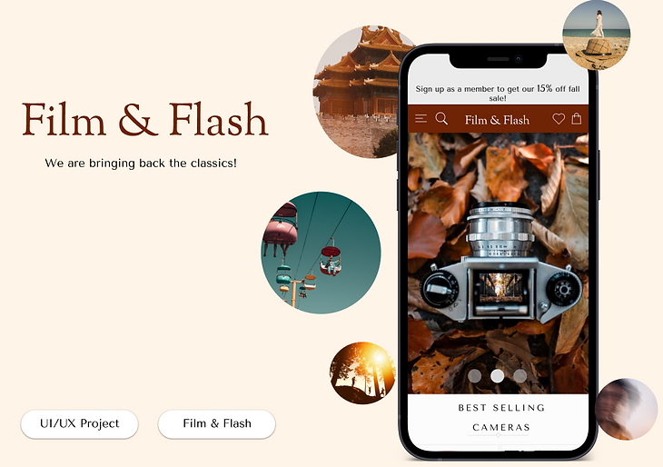
Film & Flash is an e-commerce site that is dedicated towards becoming the go-to brand for
obtaining high-quality film cameras.
Problem Statement
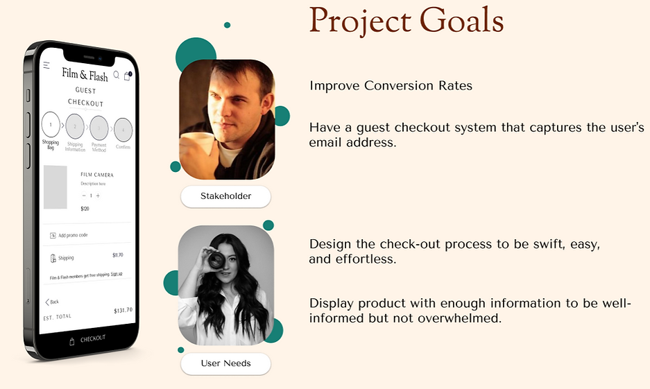
Ultimately, Film & Flash wants to improve their conversion rates from browsing to checkout in order to increase profit on their mobile-web experience. Furthermore, they would like to have a guest checkout in place as their current system requires guests to create an account.

DISCOVERY PHASE
Participant Screener
Competitor & Comparative Analysis
Internal Stakeholder Interview
In this project, I recieved stakeholder insight via Film & Flash's Project Manager. I continued my journey by researching and studying the user experience of other succesful competitors. Using the information during my research, I developed 4 project goals.
DEFINING PHASE
User Persona
Usability Participants
This section is where I narrow down the audience in order to select the correct participants for usability testing. Additionally, by defining my users, I am able to gather meaningful insight that will ultimately impact my design decisions.
_edited.jpg)
IDEATION
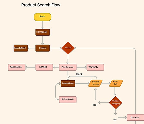
User Flow
Below are two user flows. Both paths are necessary to fulfill the user and business goals established at the beginning of the project. The first flow highlights how users would experience finding a product, the second is how a user would navigate the checkout flow.

DESIGN
Lo-Fidelity Frames
Mid-Fidelity Frames
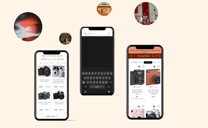
Hi-Fidelity Frames
Prototyping
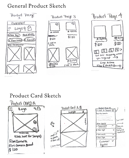
Once completing the user flow, allowed me to create an outline of the necessary frames needed for the remainder of the project. As mentioned before, each frame was specifically designed to enhance the user's experience while also subtly pushing users to become customers.
Lo-Fidelity Frames
.png)
.png)
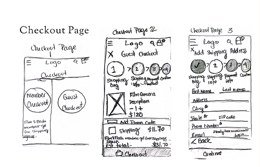.png)
Mid-Fidelity Frames

Using Figma, I translated my sketches into a digital platform. Thus, all the messy sketches became more refined and legible.It is important to note that I used my mid-fidelity frames to complete the first phase of the usability testing.
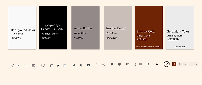
For this visual guide, I wanted the color palette to capture the class and beauty of the film. I chose the timelessness of grays and blacks to portray the elegance and sophistication that this brand carries. Meanwhile, I chose cedar wood brown to display security and dependability when purchasing high-quality products on their site.
Ultimately, the users should feel they are purchasing from a reputable company.
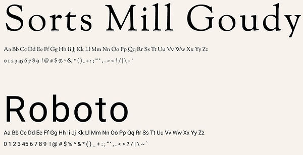
Fonts
_edited.jpg)
.png)
Hi-Fidelity Frame Version 1
TEST
Reiterations & Final Hi-Fidelity Highlights
The final phase of thie project was the usability testing. Using the high-fidelity frames above, I was able to make any final reiterations on my designs. While I have made many reiterations, below I selected a few and described the change between the two frames and reasoning behind it.
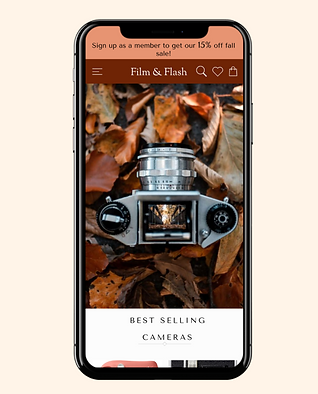
Homescreen Changes

-
Made the CTA banner lighter so that it is more legible
-
Moved the search icon on the left side - users often stated the Film & Flash icon looked unbalanced.
-
Added a "coursel" featured. Users stated they like to swipe and see what products are available.
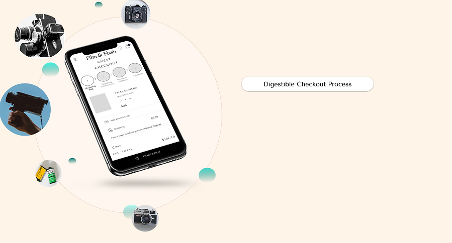
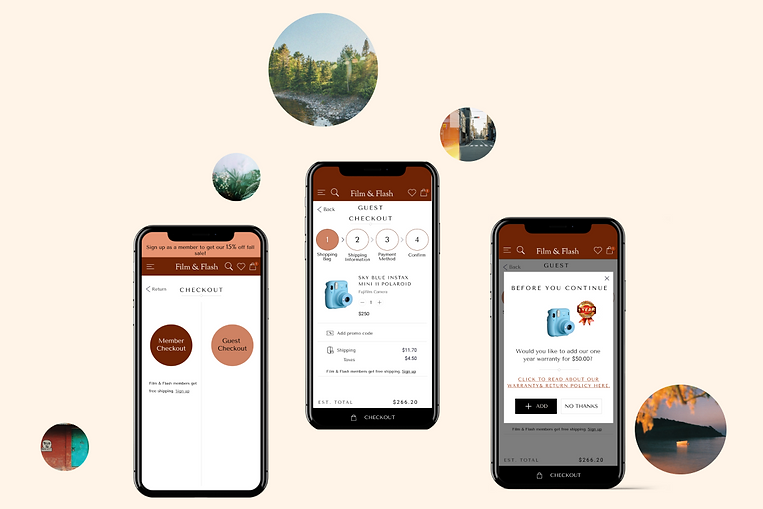
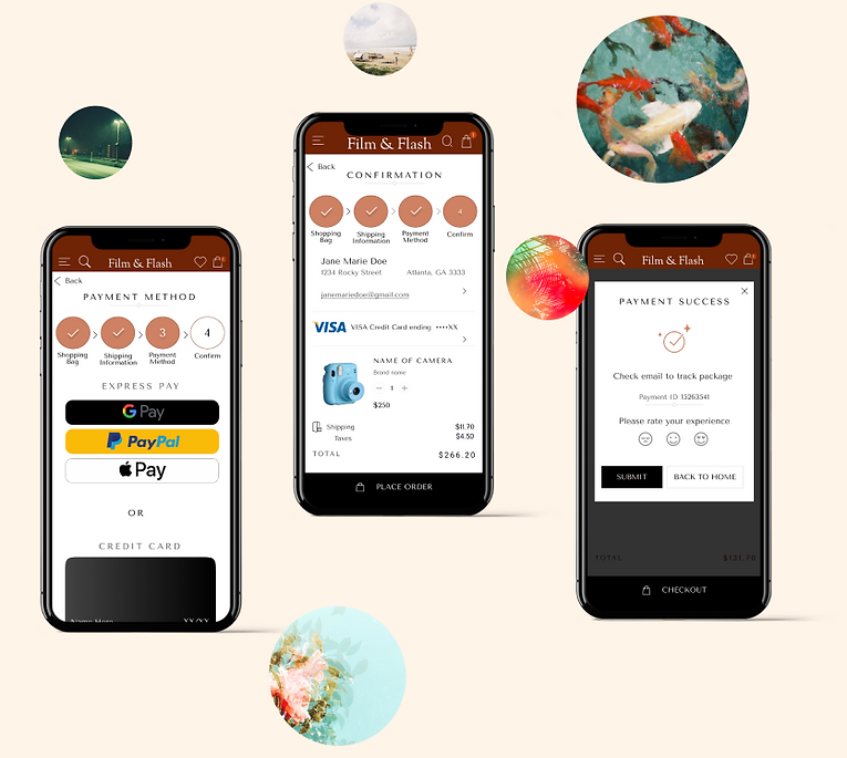
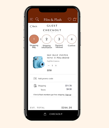
Checkout Process

-
The text and icons within the circle were enlarged to make it more legible.
-
The colors were adjusted to align with the accent gray used for the CTA banner.
My Lessons
Guest Prototype
Film & Flash was the first project I have ver been tested on creating an e-commerce design. In this project, I not only had to get in the mindset of the consumer, but also the mindset of the producer. It was its own unique design challenge that deepend my understand of UX/UI and human psychology.
When it comes to designing an e-commerce site, the most important aspect is ensuring users feel they can trust the site.
Establishing security through design elements such as color, text, and icons can make or break security with users.
I learned that users enjoy convenience. Breaking down the checkout flow into easy, digestible steps makes the checkout process less overwhelming.
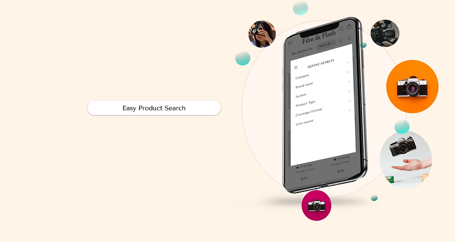
Additionally, it is crucial to align user's mental model eases the friction when users search for products.
Finally, how much information is displayed is almost as important as how the infromation is displayed. It should be clear, concise and straight to the point.
At the end of the day, the users are trusting Film & Flash to get quality cameras.
Click the screen below to interact with my prototype!